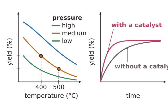
Graphs help industry choose conditions. A graph of percentage yield against temperature for an exothermic reaction such as the Haber process slopes downwards, because the line falls as the temperature rises. If there are several lines for different pressures, the line for the higher pressure sits higher on the graph, which shows a larger yield at equilibrium. To read a value, find the temperature on the horizontal axis, go up to the line, then read across to the yield.
A graph of yield against time rises and then goes flat. The flat part shows that the reaction has reached equilibrium. The reactions have not stopped: the forward and reverse reactions are still happening at the same rate. The height of the flat part is the yield. A steeper line at the start shows a faster rate.
Adding a catalyst makes the line steeper, so equilibrium is reached sooner, but it levels off at the same height. Example numbers: if a graph shows a yield of 40% at 400°C and 20% at 500°C, subtract the two readings to find how far the yield falls when the temperature rises by 100°C. The difference between two percentages is measured in percentage points.